An optimised website takes your business to the next level. Done right, you are looking at an increased revenue from conversions. Moreover, visitors will return to your site again and again. Our recent case study highlights what we did.
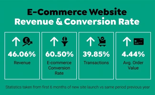
Optimising our client’s website included increasing conversion rates and driving more traffic from Google. Our changes and Conversion Rate Optimisation (CRO) produced impressive results. Within 6 months, the optimisation strategies had paid off. We witnessed the following:
These notable results were based on comparisons to the same trading period the year before. Customers were responding positively to our changes. Here are the 5 key steps we took.
Collecting data was the first step. Firstly, we identified pain points. Analysing how customers search for products and services on a website is important. Secondly, we worked out the best ways to scale up the user experience (UX). Then, we put the ideas into action, see below.
Our client’s old website simply wasn’t wowing the customers. So we studied the analytics, set up heat maps and discovered that people quickly lost interest and went elsewhere. This meant we needed to improve the overall User Experience (UX) and User Interface Design (UI).
Feeding from the analytical data, we knew that we needed to make it much easier for potential customers to find what they were looking for in fewer clicks. So we refind the navigation menu to make it more straightforward and intuitive, which is key to a positive UX. In addition, we ensured that the most critical elements were in prime positions and refreshed the visual elements, which resulted in a more sophisticated new look. Creative use of colours, fonts and images also made a bolder impression whilst retaining the overall brand image.
Also, we optimised the site for Google bots which made the website more visible on search engines.
Next, the mobile UX design needed our attention. According to Google consumer insights research, 50% of people won’t consider buying from a brand that has a poorly designed mobile site. Therefore, responsive design is a critical aspect of improving UX. Our job was to make sure our client’s website work seamlessly across all devices. No matter what the screen size.
An active SEO campaign boosts our client’s online presence. For example, at first, we conducted keyword research. Then we used high-quality content with the relevant keywords and long tail keywords to reach customers. Afterwards, we noticed an increase in visitors to the website. We will continue to monitor keywords and content to drive leads.
Even after we launched our client’s new site, we continued to run tests. A/B testing takes the guesswork out of website conversion rate optimisation. It allows us to compare different versions of a webpage to see which one performs the best.
This invaluable data makes it easier to pinpoint where we need to make improvements on the site. For example, we ran tests of the call-to-action (CTA) buttons. Subsequently, we discovered what made the customers click. On one version, our changes had a hugely positive effect on the user experience. To illustrate, it resulted in a 90% increase in CTA action.
Ultimately, we have a happy client. Their optimised website means bigger profits, better e-commerce conversion rates, more transactions and an increase in customer spend per order.
To sum up, if you don’t have an optimised website, you will lose business. Customers are going to spend their time and money on another website – your competition. Analysing the user journey and making improvements are part of the process. A/B testing and an active SEO campaign are integral to website success, too.
Is it time to optimise your web design and improve the UX? Get in touch. We’re here to help. Call TRCREATIVE for a chat today.